
While translation is about getting the message right, international DTP (desktop publishing) or typesetting is about getting the look right. We work with typesetters all over the world to create translated layouts that maintain the creative integrity of the original asset while being appropriately adapted for the in-language market. Rendering an attractive and professional design in a DTP program like InDesign or Photoshop requires a thorough knowledge of the software. Once you introduce elements like expansive text, different scripts, and diacritic marks, further expertise is needed.
Expansive text
Our primarily requested languages for translation are Spanish and Canadian French, which are both Romance languages. Most Romance languages (languages derived from Latin) expand from English by about 20 – 25%. So, a one-page flyer in English where the text takes up the entire page is unlikely to remain one page in Spanish or French. Decreasing font size is the obvious way to get more words to fit in the same amount of space, but we try to avoid doing that in international DTP. Decreasing leading (the vertical distance between lines of text) and/or tracking (the distance between letters) can create additional space in a more subtle way than decreasing the font size, and with less impact on readability. The same goes for other layout options like text box margins and column width. Of course, going overboard with any of these strategies can also impact readability or simply make your translated layout less attractive. This is why we work with expert typesetters with experience in international DTP and always have the translator do a visual proof of the translated layout. We refer to this step as linguistic quality assurance (LQA). LQA involves checking for things like typos, while also bringing a critical eye to the design in the target language.
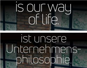 The German lexicon famously includes many words with 15 or more letters. Splitting English words across lines with a hyphen can impact readability and is almost never appropriate for a marketing piece with minimal copy because it dampens visual impact. Because long words are so prevalent in German, hyphenating is sometimes preferable to alternatives that might require drastically reducing font size or leaving huge gaps between words or at the end of a line.
If you’re designing a layout for a piece that you know will be translated, we recommend doing some research or asking your LSP about whether the translation is likely to expand. Depending on the answer, you may want to build the source file with some extra breathing room. And if your target language tends to contract compared to English (this is almost always the case with Chinese), you will also want to be sure that your final translated layout does not leave big open spaces that make the layout look empty and unfinished.
Font support
 When preparing an asset that will eventually be translated, we also recommend doing some font research. Is there a font that will support all the languages you’ll need? Be sure you’re aware of all characters that might be needed. Many people are familiar with accented characters like é in French, ö in German, and ñ in Spanish. But these are just the tip of the iceberg. Languages like Polish, Turkish, and Vietnamese use the Latin alphabet as their base but have several additional letters and diacritic marks that aren’t supported in many fonts.
Then of course there are languages that use scripts other than Latin. Some fonts (like Noto Sans) have versions for the Latin alphabet as well as writing systems such as Arabic, Chinese, Greek, and Ukrainian. Other fonts are script specific. One such font that recently came to our attention is Adobe Gurmukhi, which is used to write the Punjabi language in India.
 Selecting the proper fonts may be all you need to do to ensure that your translated layout looks just the way it should. For fonts like Adobe Gurmukhi, however, the correct font is only the first step. Languages with scripts that Adobe considers complex, such as Punjabi, Hindi, Arabic, Hebrew, and Thai, all require the use of Adobe’s World Ready Composer. This is found in the Paragraph Style Options menu under “Justification > Composer.”
But wait, there’s more! Font discrepancies across systems can cause rendering issues. If you’ve ever opened a Word document and it had a bunch of boxes in it where letters or characters should be, you’ve experienced this issue. When we’re working with languages that use non-Latin scripts, we typically have our translation teams send us a PDF of the translations (along with a live text file) because a PDF will show a static snapshot of how the characters should appear. Typesetting in Burmese is a fascinating case study that we cover in our post about the challenges of international DTP.

The Hindi translation for “October 5-19, 2022” as rendered in Microsoft Word
On the other hand, sometimes what appear to be font discrepancies are not. On a recent English > Hindi translation job, when I saw differences between the PDF exported by our typesetter from Adobe InDesign and the PDF that our Hindi translation team had sent us, I thought for sure the culprit was international DTP gone wrong. I marked up a few instances in the exported PDF to bring to the translator’s attention during LQA. So, imagine my surprise when the translator didn’t indicate that those instances were incorrect! When I asked them about it, they replied that “MS Word keeps the conjuncts separate while Adobe products combine them.”

The Hindi translation for “October 5-19, 2022” as rendered in InDesign
Having never studied Hindi, I wasn’t familiar with this concept. I did some research and learned that certain letter combinations in Hindi are typically written in a distinct form. So as explained by the translator, the same letters are present in either presentation, they are just written differently. This is one reason we always have our translators do LQA on a typeset asset. We want a native speaker to make sure the translated layout is legible and correct, that the formatting matches the source document whenever possible, and that appropriate alternatives have been used where the translation cannot exactly match the source. Certain choices that are made for the English-language artwork may not be correct or suitable in the target market. Italics, for example, are rarely used in East Asian languages and we typically substitute underlining for italicizing in these cases.
 International DTP can sometimes begin before a single word has been translated. If you are typesetting a design that will ultimately be in languages other than English and you’re looking for an LSP that accounts for style as well as substance, contact us to see if we could be a good fit for you!
