
Challenges in multilingual typesetting can sometimes feel like unsolvable puzzles. Experienced and dedicated language service providers (LSP) will have the foresight to preempt certain difficulties that international DTP may pose and the skills and understanding to get to the bottom of complications they haven’t faced before. In this post we’ll explore a few of the more obscure challenges in multilingual typesetting that we’ve managed.
OpenType fonts versus TrueType fonts
Selecting fonts can be challenging for several reasons. When you’re designing an asset, you select a font that you think will be readable, attractive, and appropriate. In translation, it’s important to select a font that not only fulfills these criteria, but that also has character support for your target language. You can read more about this in our posts about free web fonts and international DTP more broadly, but another important piece of this puzzle came up during our QA check on a print piece a few years ago.
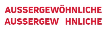 We had translated a flyer into German, French, and Spanish. We are accustomed to seeing certain characters not even appear in Adobe InDesign because the source font only supports the 26 Latin script letters of the English alphabet. When working with these flyers in InDesign, all the characters displayed as intended and even the exported PDFs looked just fine. When we printed hard copies of the flyers, however, we immediately noticed that none of the accented characters had printed. We always QA both a digital and a print copy of our translations, as the eye can be drawn to different things in different mediums. Seeing accented characters display perfectly normally on our computer screens only to disappear on a hard copy was new for us!
After a fruitless internet search, we began comparing all the elements in the source design package to previous versions of the flyer. As luck would have it, this client has been using a “base” version of this flyer to advertise a yearly event, so we had at least one previous version against which we could compare the current files. Once we got into the Fonts folders, we realized that prior versions came packaged with .otf font files, whereas the current iteration had come packaged with .ttf font files. We swapped out the .ttf files with .otf versions and voilà! The hard copies printed with all the accented characters in place.
OTF stands for OpenType font and TTF stands for TrueType font. According to Adobe, OpenType fonts use a single font file for both Windows and Mac, and “include an expanded character set and typographic layout features, providing broader linguistic support and more precise typographic control.” Since we’re not printers (and we are still not able to find straightforward answers about this online), we still can’t quite explain why the .ttf fonts display accented characters perfectly well on screen but not on hard copy printouts, while the .otf fonts do both.
The moral of the story is that if you’re designing with globalization in mind, be sure the fonts you’re choosing give you the functionality you’ll need across languages and mediums. And if you don’t feel comfortable choosing fonts with this type of flexibility, be sure you’re working with an LSP who is willing and able to advise you on font selection (like we did for a client doing multilingual typesetting for a comic book).
Burmese fonts
The history of Burmese fonts is an interesting study in the intersection of sociolinguistics and digital mechanics. Developments have been made in the six years since we published our blog post “Why are Burmese Fonts so Problematic?” but Burmese DTP can still feel like one of the more dauting challenges in multilingual typesetting.
As of October 2023, Adobe’s website still warns that “South Eastern Asian (SEA) languages or scripts are not currently supported on all Adobe products” and the only font in the Adobe Fonts library that lists support for the Burmese language is Myanmar Text. For years, we relied on using the Zawgyi One font in both Microsoft Word and Adobe InDesign. Doing so allowed cross-functionality between our translation teams and typesetters. Even so, there were often still hiccups along the way. Given the history of Burmese font development, our Burmese translation teams are well-versed in font rendering issues and are always ready with suggestions for how to resolve them.
In the summer of 2024, we ran into an issue we hadn’t before. When our typesetter first dropped the Burmese translations from Word into InDesign using the Zawgyi One font, various character elements did not display where they should. The black script below is the translation in Microsoft Word, and the green script is what the initial PDF exported from InDesign looked like.


The yellow highlights show where the circle in the lower half of the text is not aligned properly.
After pointing this out to our typesetter, they got to work to remedy these errors. When they returned a revised PDF, they told us that after struggling to get the circles to align properly in Zawgyi One, they tried changing the font to Noto Sans Myanmar. This font change automatically resolved the misalignments! You can see the correction in the image below.

 And before you worry about whether the other subtle differences between the two examples above are errors introduced when the font was changed, consider the differences between Courier New and Edwardian (pictured at right). And why should English fonts have all the fun? 😉 The differences between the Burmese fonts pictured above are certainly more subtle than the differences between Courier New and Edwardian, but the difference between the stylistic flair of a certain font and a typographical error can also be subtle. That’s just another reason we always submit typeset files to the translation team for linguistic quality assurance (LQA)!
Justification and other visual treatments
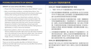 Designers who attempt multilingual typesetting without any background or experience in translation may take choices such as justification for granted. But in the same way that business etiquette and communication styles differ across some languages and cultures, you can’t assume that best practices for English-language layouts are best practice for layouts in other languages. Justifying across the entire page is preferred on most Chinese-language layouts. Like with English hyphenation or subtitling rules, however, there may still be instances when it would be better to keep a certain group of characters together rather than splitting them across two lines. This is another opportunity for your LSP to marry translation and design into the most reader-friendly presentation.
Other stylistic elements such as italics, dropped capitals, and small capitals can also trip up typesetters who are used to working only with English text. According to a Japanese translator that we have worked with for years, italics aren’t normally used in Japanese. And for languages that do not have uppercase and lowercase alphabets (such as Arabic and Korean), all caps/small caps are not applicable. When these treatments are used for emphasis, we always consult with our translation teams about how to achieve the same emphasis in a more linguistically appropriate way. A drop “cap” can be faked by simply making the first letter of the word or the first character on the line larger, but we always ask our translation teams to weigh in on stylistic choices like these as well. A style that may be considered elegant or eye-catching in one language may look confusing or disjointed in another.
Overcoming challenges in multilingual typesetting
This post is certainly not an exhaustive list of all the complications that may arise when working with translations in design software. Developments that improve certain capabilities may also create new and unexpected challenges in multilingual typesetting. You needn’t give up or settle for awkward workarounds when you have a partner in translation that has the experience to handle many issues and the dedication to resolve ones they haven’t seen before. Whether you’re at your wit’s end or are interested in learning more about avoiding a wit’s end scenario moving forward, ask Language Solutions if we can help!

This insightful read highlights the intricate challenges in multilingual design, from font compatibility to layout nuances. Really appreciate the practical examples and tips for smoother collaboration between translators and designers!